Bollywood
And also the inputs need work. For example the title, the text inputs, the text area, for example, is not right. The cursor's on top and the lines on the bottom don't look right. Like in a text block, for example, to write something, the placeholder. There's so much gap between the cursor and the bottom border.
We need to rethink with fresh eyes how we want to have these input input blocks and even the pop-ups. You're saying the pop-ups are going to be true white? Even the modals and popovers, it needs to harmonize with the other colors. It doesn't have to be true white so it can be harmonized. I can actually show you some colors from the quarter project as well
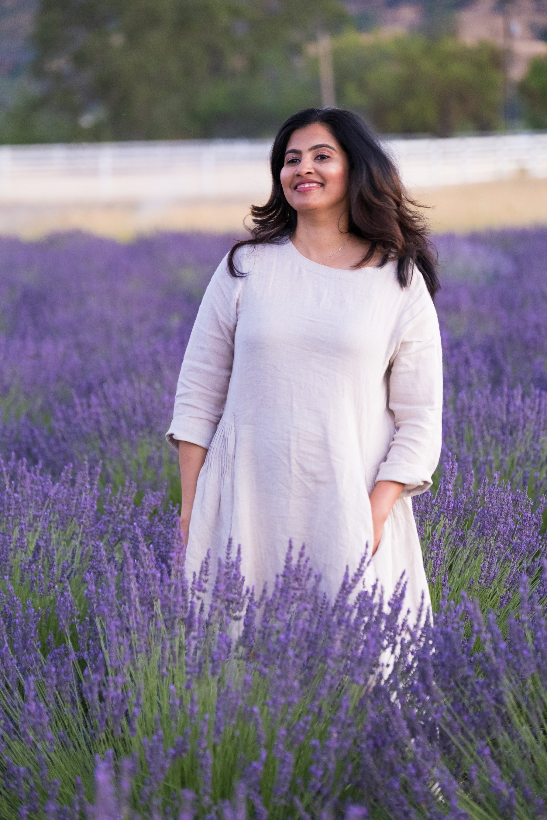
Lavendar fields are beautiful